AI travel SaaS
Brand design
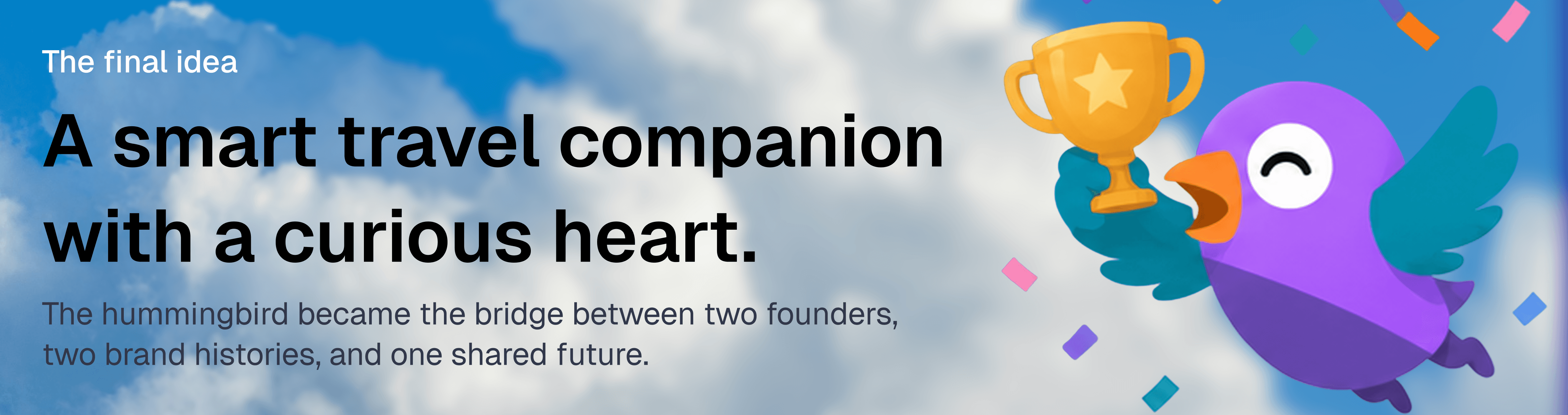
I transformed an inherited hummingbird concept into a lively mascot-led identity system for Intripid, preserving the founders’ original brand elements while creating a flexible visual language for emotion, trust, and travel storytelling.
Sept 2024 - Oct 2024
Lead Product Designer
Intripid

Intripid did not begin as a blank-page branding project. It began with two founders, two existing brand worlds, and two things neither side wanted to lose.
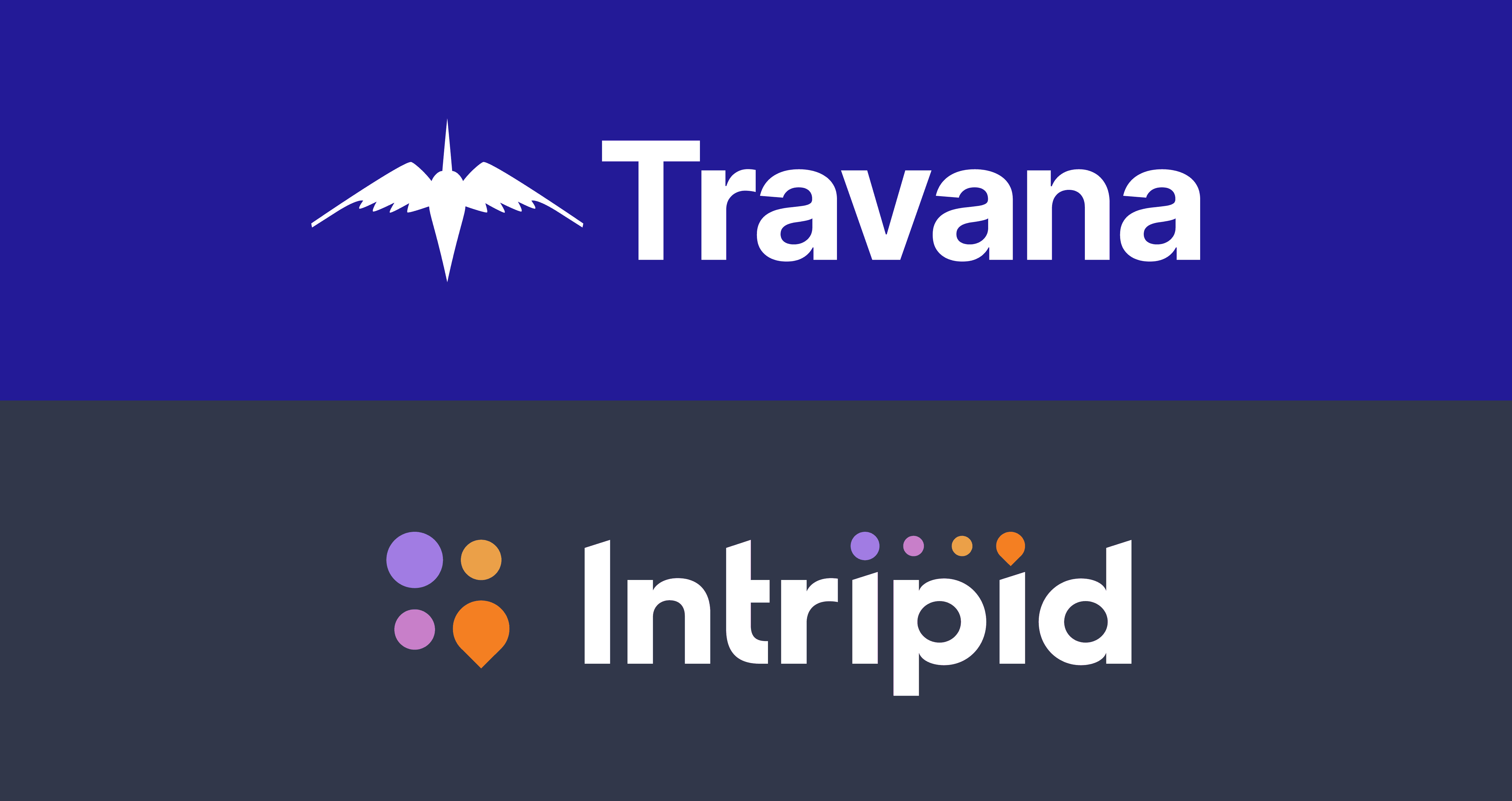
One founder brought Travana, a travel idea with a hummingbird at its center. The other brought Intripid, a brand with a bold color palette that already felt energetic and ownable.
My role was to bring those two worlds together and turn them into one identity system that felt alive, strategic, and emotionally memorable.
Two founders, two things worth keeping
The project started with a founder alignment challenge. The Travana side had a hummingbird concept that carried emotional value. It represented movement, travel, and the early spirit of the idea.
The Intripid side had a color palette that felt bold, digital, and recognizable. The colors were not something the founder wanted to leave behind.

The old bird had meaning, but not enough life
The original hummingbird concept had symbolic value, but it felt too sharp and static for the new brand personality.
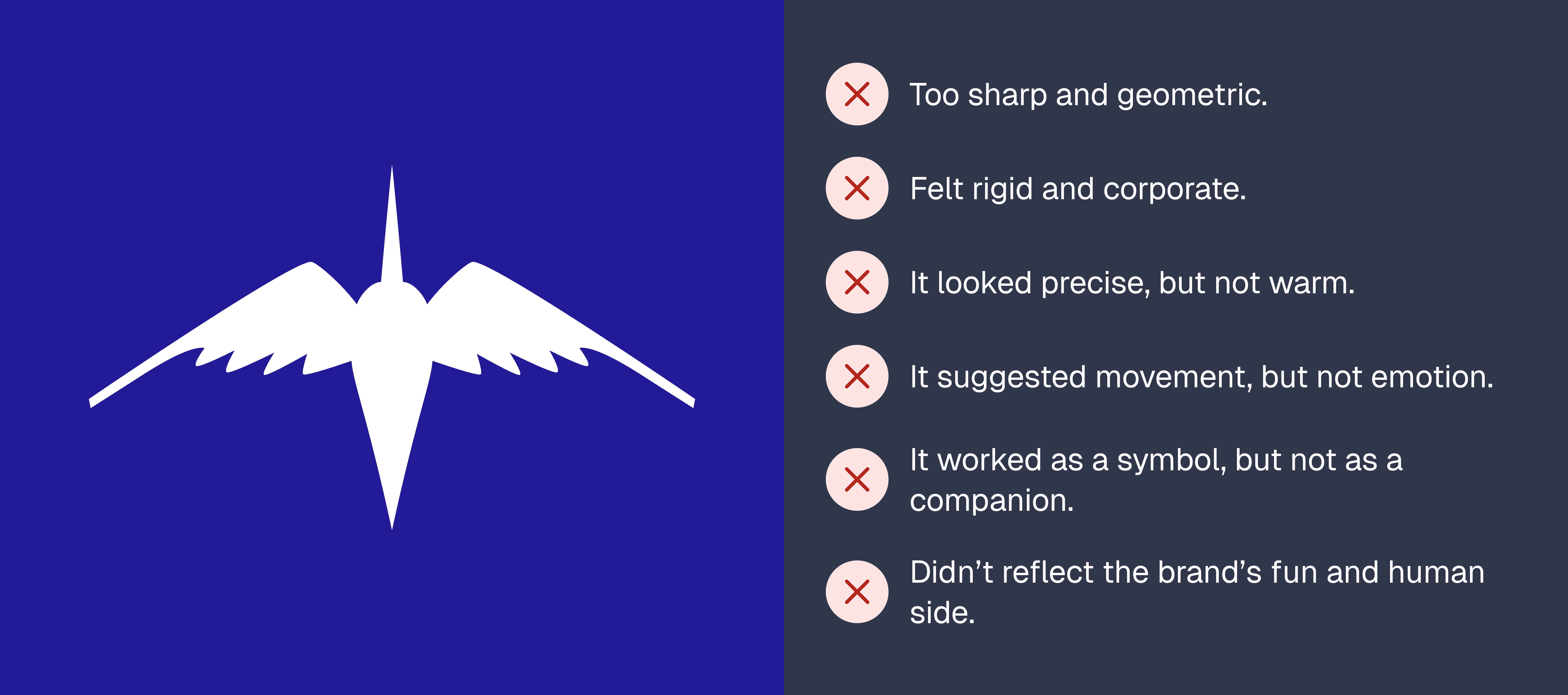
For an AI travel planning brand, that was a problem. Intripid needed to feel helpful, friendly, curious, and emotionally present. A sharp icon could identify the brand, but it could not carry the full personality of the experience.
The real problem was not the logo
Most people might describe Intripid as an AI travel planner.
But the real problem was deeper.

So the brand needed to do more than communicate technology. It needed to reduce anxiety, create confidence, and bring back the joy of imagining a trip.

Defining the brand before redrawing the bird
Before redesigning the hummingbird, I worked through the brand strategy.
The final personality direction became:
Reliable
The brand needed to feel trustworthy enough to guide real travel decisions.
Innovative
It had to reflect an AI-powered planning product.
Exciting
It needed to preserve the emotional spark of travel.
Friendly
It had to feel approachable, warm, and easy to use.
The tone direction added three more qualities:
Curious
Open-minded
Aware

Studying the behavior behind the symbol
Instead of simply redrawing the logo, I studied the real behavior of hummingbirds.
Hummingbirds are known for unusual flight abilities: they hover, move with agility, and can fly backward, which makes them feel light, fast, and highly responsive. Cornell’s Bird Academy describes hummingbirds as birds that hover, fly backward, dazzle through color, pollinate, and migrate, which made the bird a strong metaphor for movement and discovery. Audubon also describes hummingbird flight as unusually flexible, including hovering, backward and forward movement, and rapid directional changes.

That behavior helped reframe the mascot.
The hummingbird could represent:

From sharp symbol to lively character
The redesign kept the idea of the hummingbird, but changed its role.
The original mark was a sharp silhouette. The new identity needed a living character.
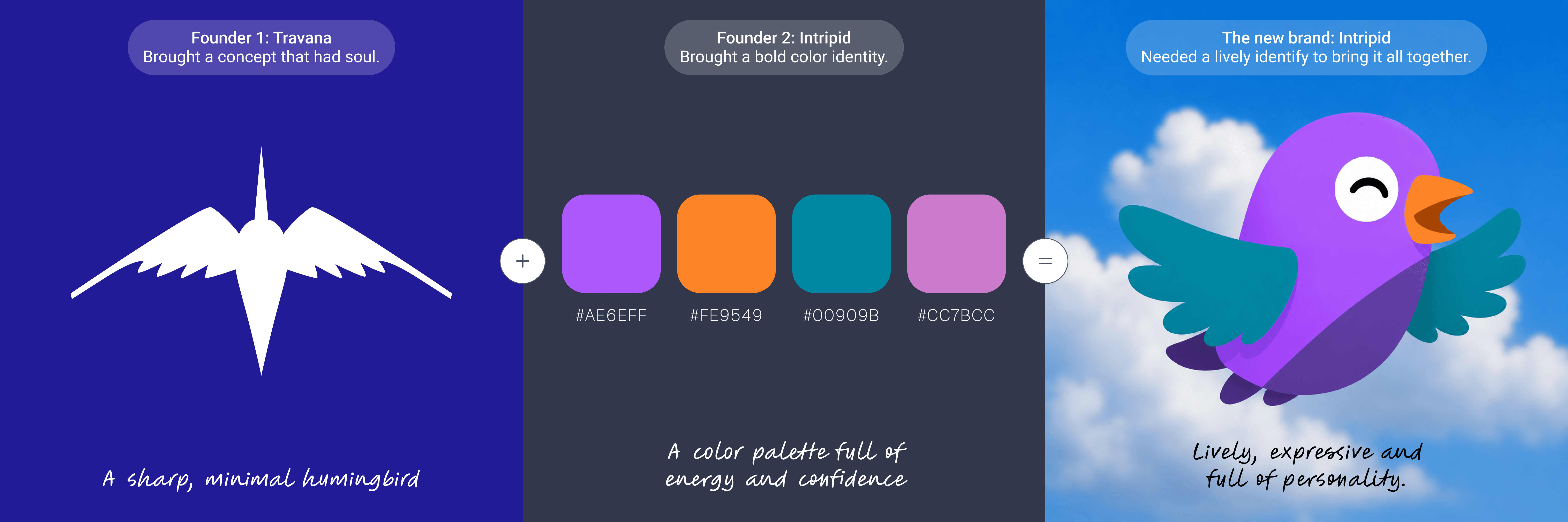
I softened the body, opened up the wings, rounded the forms, and gave the bird an expressive eye. Then I brought in the Intripid color palette so the mascot could carry both parts of the brand’s origin.
The purple body became the brand anchor.
The orange beak added warmth and action.
The teal wings created freshness and movement.
The secondary pink added softness and emotional flexibility.

Designing moods for real brand moments
Once the hummingbird became expressive, it became clear that the mascot could become more than a logo.
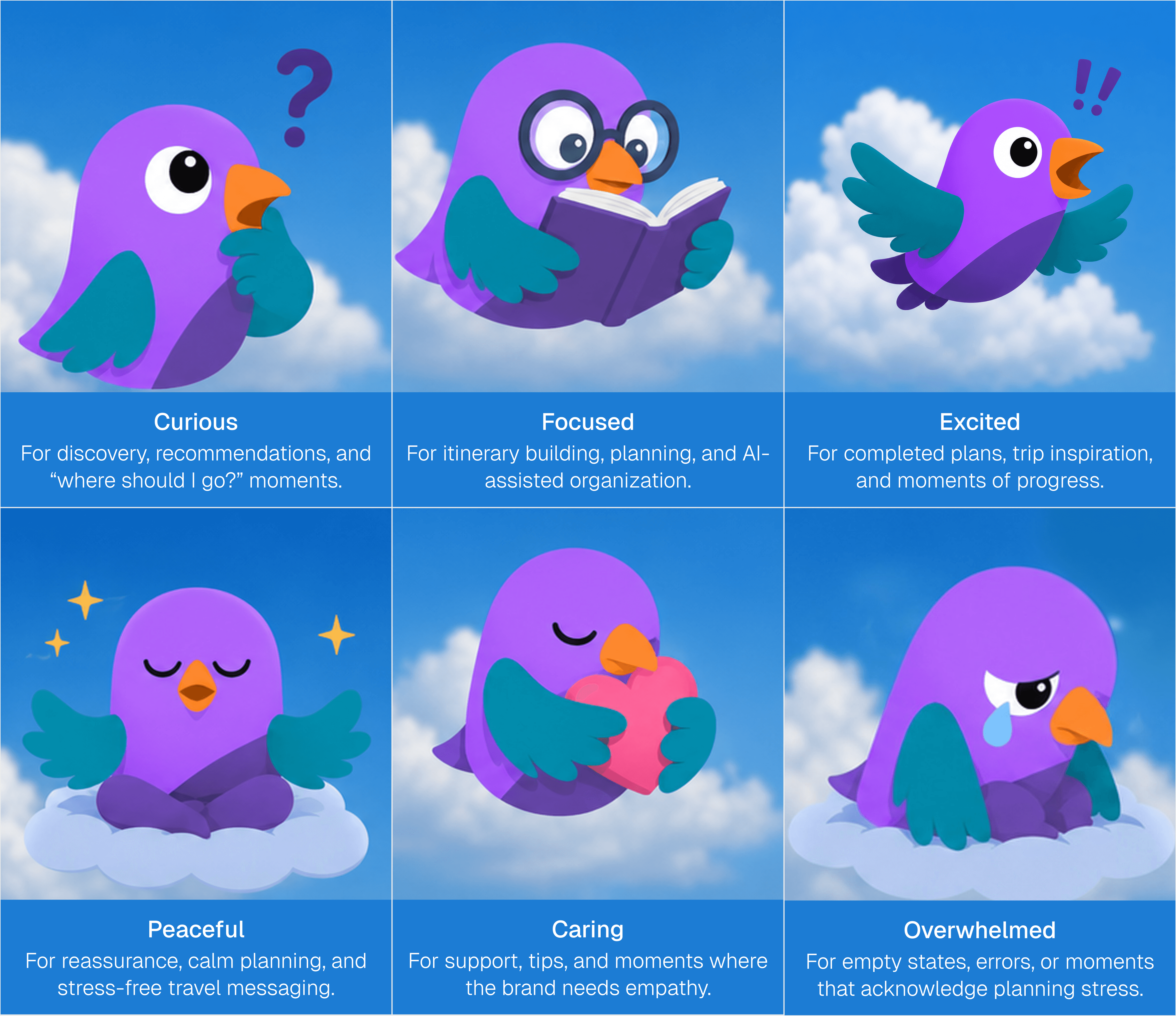
Travel planning has many emotional states. A user can feel excited, confused, curious, tired, overwhelmed, reassured, or proud at different points in the journey.
So I developed the hummingbird as a mood-based personality system.
The goal was not to create a pack of cute stickers. The goal was to create a flexible communication tool for product moments, brand storytelling, and emotional feedback.
Making the brand sound like a travel companion
The visual personality needed a verbal personality to match.
The tone of voice became:

The brand should not sound like a machine giving instructions. It should sound like a travel companion helping the user move forward.
Sample copy:
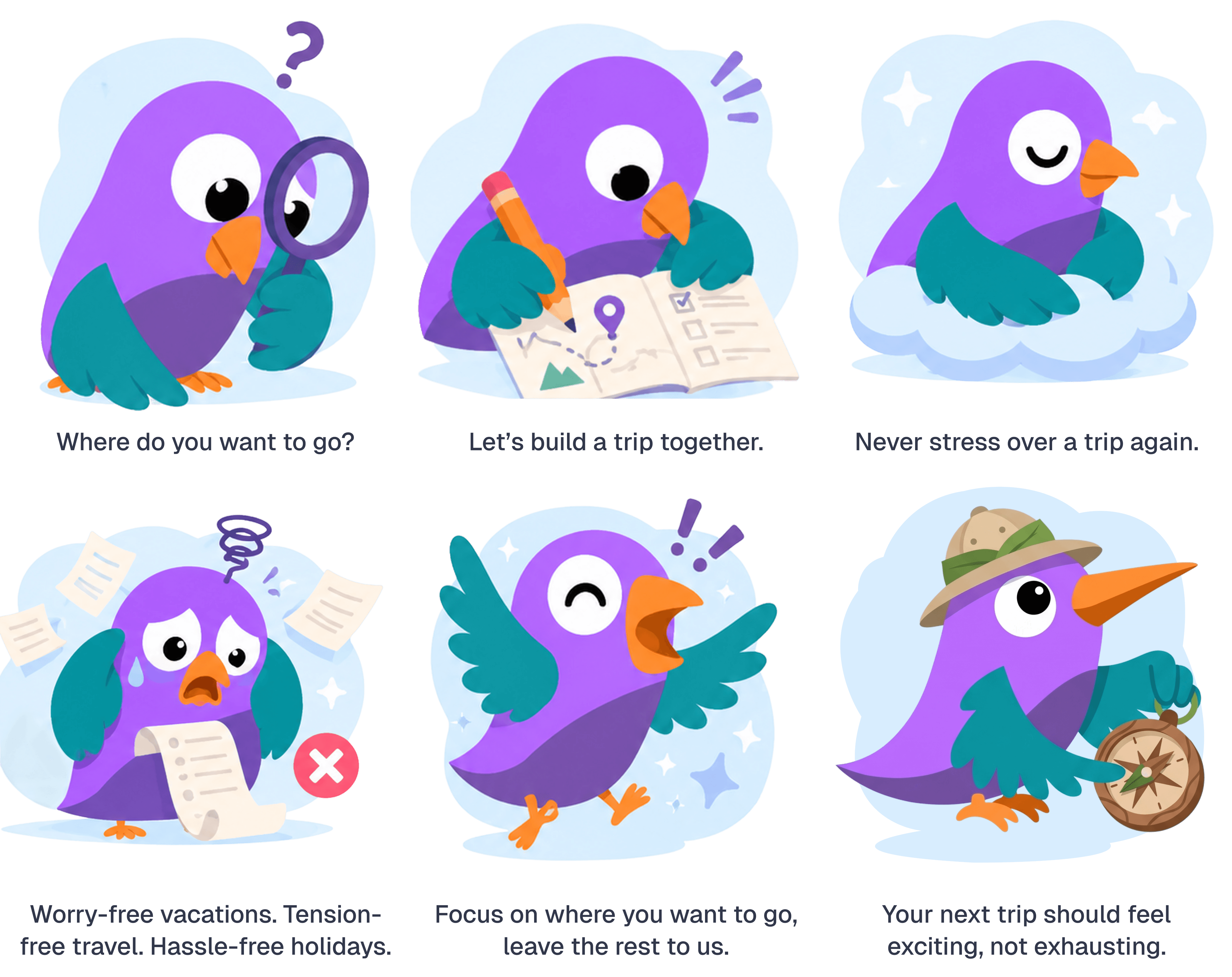

Where the hummingbird shows up
The mascot system was designed to work across the full brand experience.
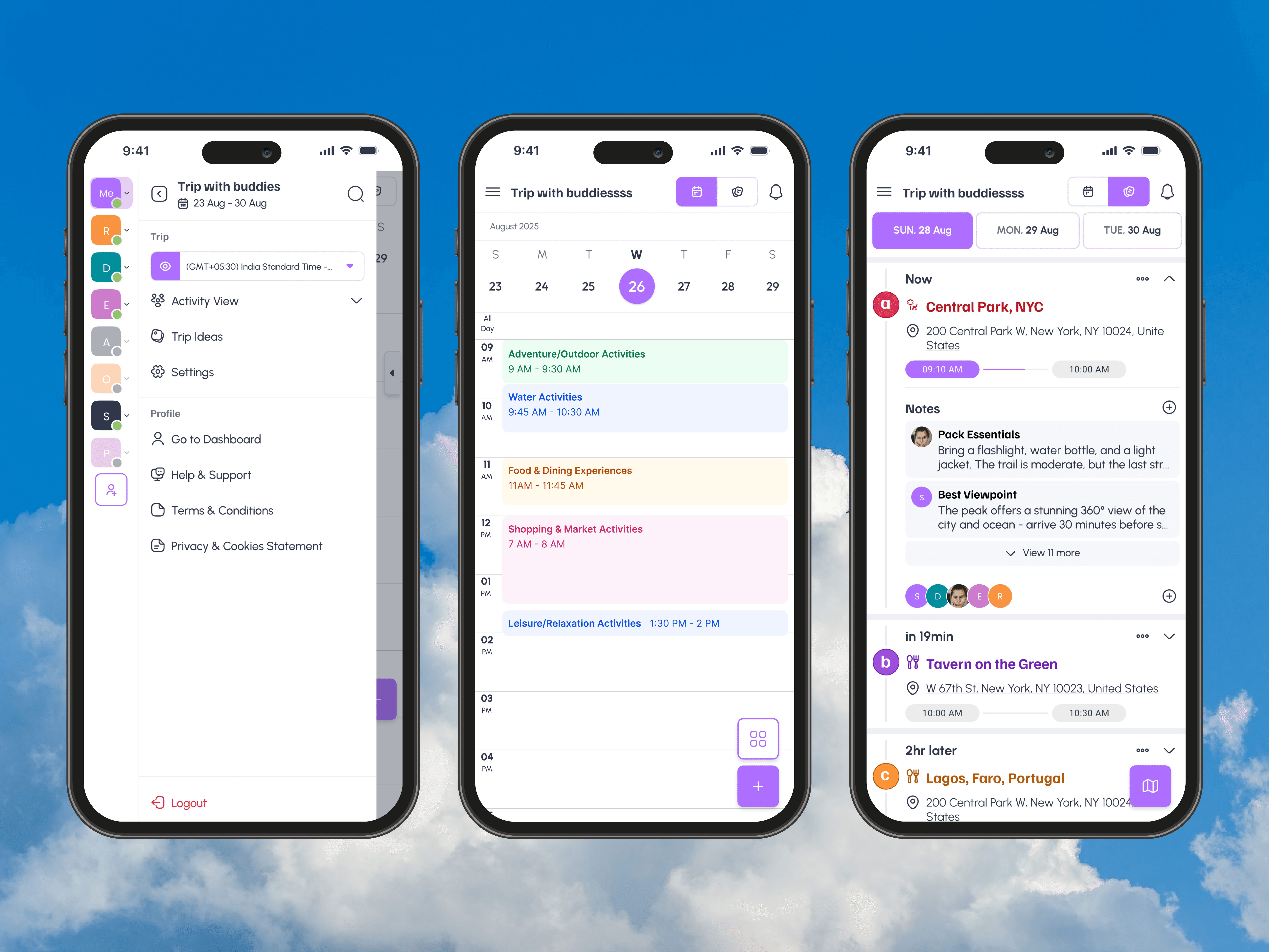
In product, the hummingbird can guide, reassure, celebrate, and explain.
In marketing, it can create recognition and emotional consistency.
In social, it can give the brand a more human and memorable voice.
In brand guidelines, it can become a flexible system for future designers and content teams.


A brand identity built for movement
The final identity system brought together:
A hummingbird mascot logo
A mood-based illustration system
The retained Intripid color palette
A friendly and modern visual language
Typography using Familjen Grotesk and Urbanist
A tone of voice built around curiosity, openness, and awareness
Brand values focused on ease, wonder, and trust
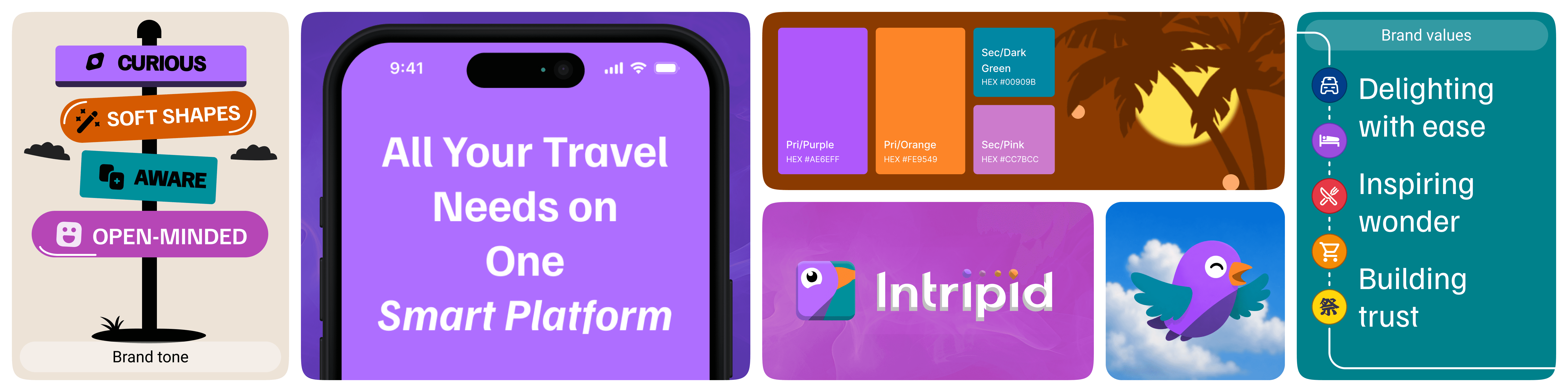
The result was a system that could feel intelligent without becoming cold, and playful without losing credibility.