I redesigned payment integrations around one shared provider model
Across Stripe, PayPal, GoCardless and manual methods, I designed one model for choosing a provider, connecting accounts, configuring methods and controlling where each one is used.
The hypothesis: businesses should not have to learn a new mental model every time HighLevel adds a payment provider.
- Company
- HighLevel · August 2025
- Role
- Senior product designer · leading payments
- Ownership
- Sole designer, end to end — provider model, interaction and visual design, rollout, coded prototype
- Delivery
- Catalogue in production · the rest staged, and working in my prototype
- Team
- 1 PM · 2 SDEs · 2 SDETs · HighRise design-system support
- Outcomes
- No product outcome measured

01 / Fragmentation
The payments ecosystem had outgrown its integration model
The problem was not the number of providers.
It was that every provider taught the product a different language.
Where it started
Every new provider added another mental model
HighLevel supported many payment providers — Stripe, PayPal, Square, NMI and manual methods among them — and each arrived with its own methods, regional coverage, account states and setup screen.
Setup took a different shape for each — rows for Stripe, a pair of cards for PayPal, side-by-side forms for manual methods — so every screen was its own design.

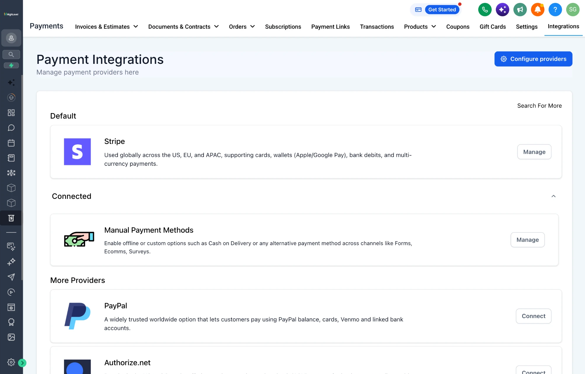
The integrations page before the redesign: a default, the connected providers and more providers, each described in a paragraph of its own.
View the complete screen
What the legacy page left to the reader
- 1Providers grouped by connection status, not by what they offered.
- 2Methods and regions written as prose, differently for each provider, with nothing to scan or compare.
- 3One default for the whole account, and nothing to say which workflows it served.
The model
Define one provider model before redesigning screens
Before redrawing a screen I needed a model the screens could share. Every provider answers the same questions — what a business can accept, where, through which account, in which environment, for which parts of HighLevel — and the model gives each one a home, separating what every provider shares from what it may vary.
One provider, described once, in three layers
01Discovery
Provider catalogue
Which provider fits?
- ProviderShared
- Payment methodsVaries
- AvailabilityVaries
- Connection stateShared
02Setup
Provider settings
Which account, in which environment?
- Accounts and a default accountVaries
- Live or testSharedLive · test
- Method configurationVariesPer areaLive · test
03Configuration
Channel map
Where is it used?
- Payment channelsPer area
- Accounts assigned, up to twoPer area
- Live or testLive · test
How each dimension behaves
- Shared — the same grammar for every provider
- Varies — values differ by provider
- Per product area — set channel by channel
- Live and test — named on the screen
The catalogue says what a provider is; its settings, which account and which environment; the channel map, where it is used.
The system direction was approved in its first stakeholder review.
02 / Discovery
Make provider choice comparable before setup
A provider logo was not enough.
Businesses needed to understand methods, availability and fit before connecting an account.
The catalogue
Choose by capability, not by logo
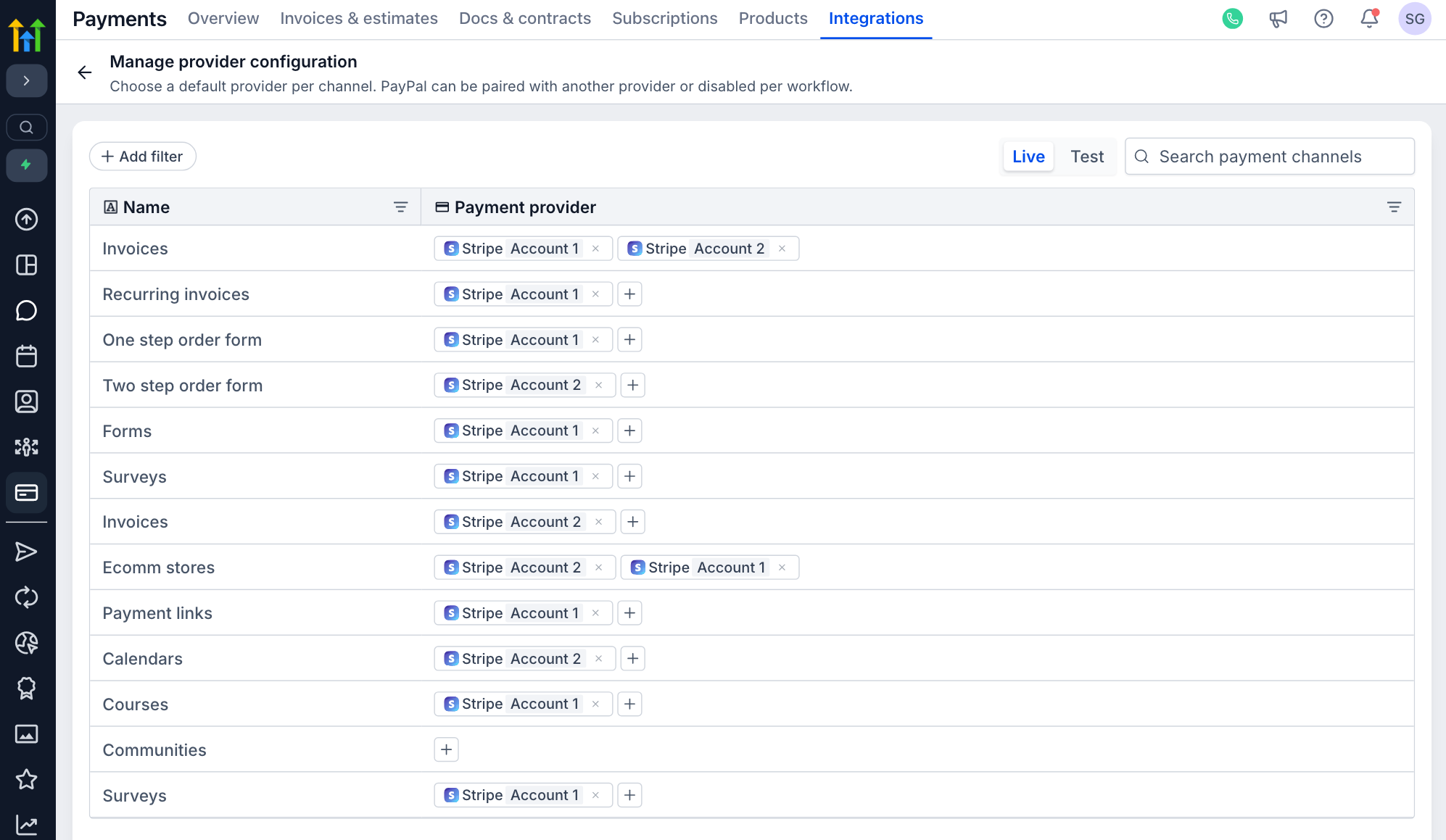
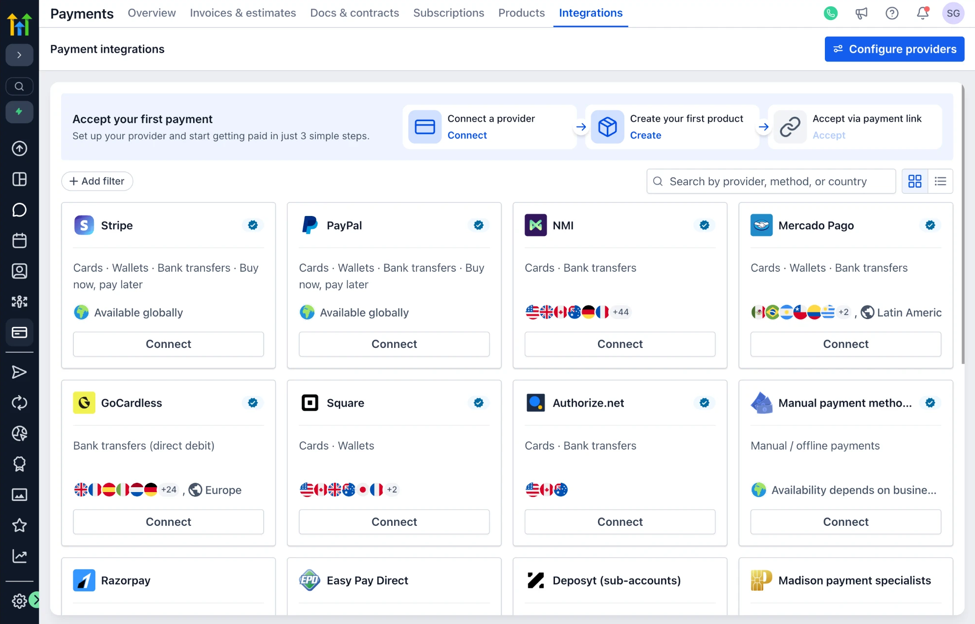
The redesigned catalogue gives every provider the same signals in the same places: the methods it supports, where it is available and whether it is connected. Search takes a provider, a method or a country, and filters narrow the set; account and method settings wait until a business has chosen.
Drag the handle, or use the left and right arrow keys, to move the divider. Home shows only the redesigned screen; End shows only the original.
Before, providers sorted into default, connected and more, each with its own paragraph. After, a grid of cards with the same method line, availability row and connect action in the same place on every one.
View the complete screens
03 / Control
Connection was only the first state
A connected account was not yet a configured payments system.
Methods, environments and product areas each needed a state of their own.
Provider settings
Separate account connection from provider configuration
Every provider’s settings now open on the same question — is an account connected? — and name the answer.


Drag the handle, or use the left and right arrow keys, to move the divider. Home shows only the redesigned screen; End shows only the original.
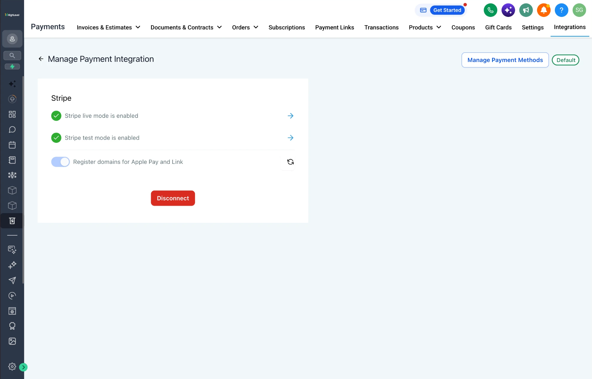
Stripe, connected. Before, live and test as two rows under one disconnect button. After, an account tab with its identity, a live or test switch, a default-account setting, a route to payment methods, and a disconnect that says what happens to payments in flight.
View the complete screens
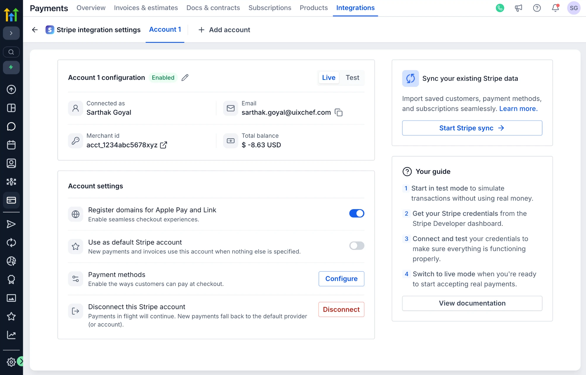
The states every provider’s settings now name
- Not connectedWhat connecting enables, and the provider’s own connect action
- EnabledWhich account, connected as whom, with its merchant id
- DefaultThe account used when nothing else is specified
- Live or testWhich environment the configuration on screen belongs to
Stripe and PayPal did not become the same screen. They became the same states.
Payment methods
Configure methods in one table, for any provider


Drag the handle, or use the left and right arrow keys, to move the divider. Home shows only the redesigned screen; End shows only the original.
Both pages scope Stripe’s methods to a product area and to live or test; the change is the shape. Before, a long list grouped by type, with where each method is popular written beneath it. After, a table — method, type, where it is popular, an enable switch — with a count of what is on.
View the complete screens
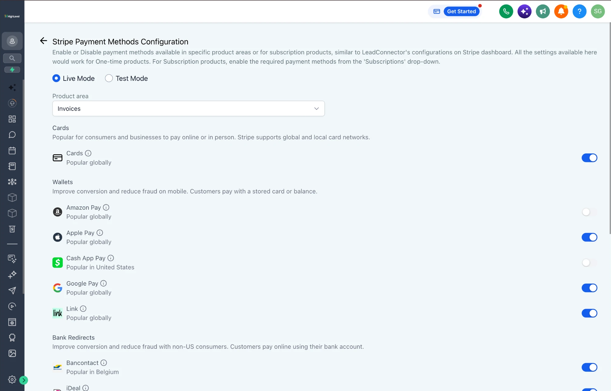
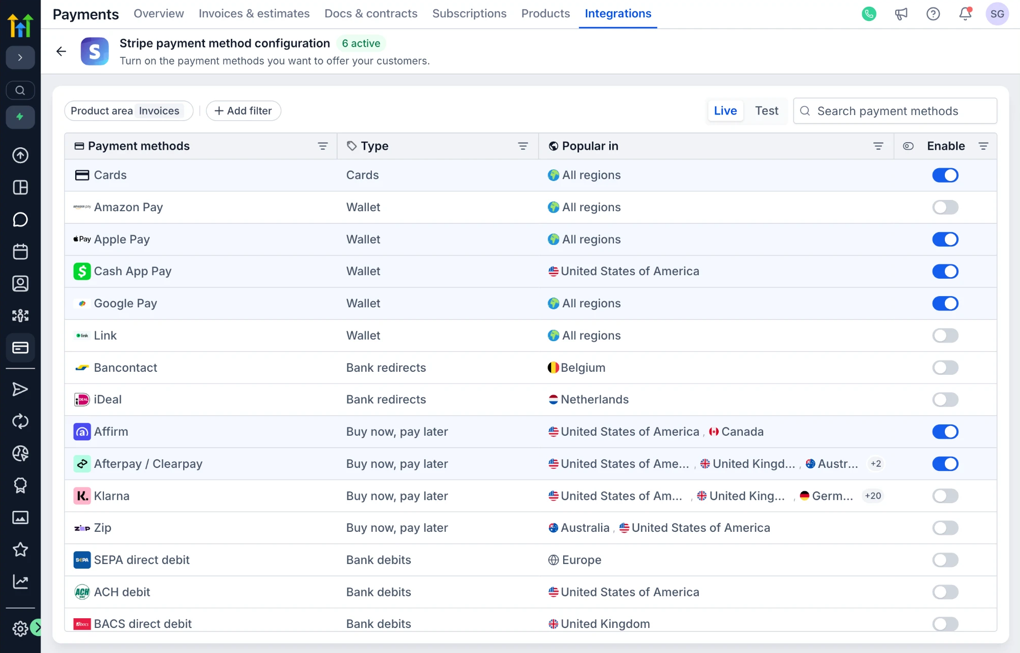
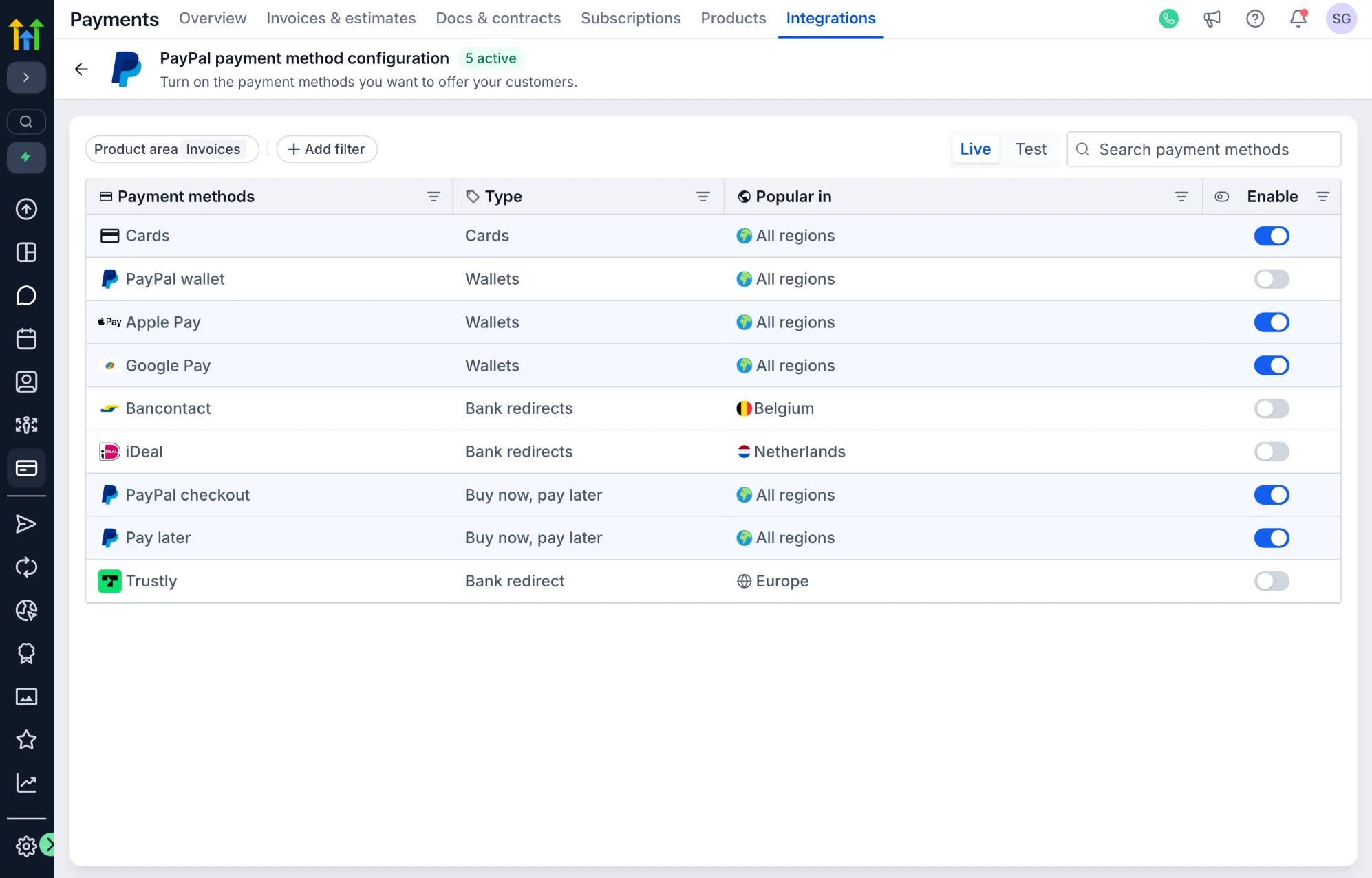
The table is one structure for any provider with methods to switch. Stripe’s long list and PayPal’s shorter one read the same way; what differs is the rows.

PayPal’s methods in the same table. The legacy product had no such page: it was designed in this project and reached a staged design, not an implementation, at the time this case study represents.
View the complete screen
The channel map
Control where each provider can be used
The one net-new capability was a channel map. Connecting a provider no longer decided where it would be used: a separate page lists every payment channel in HighLevel, with the provider accounts assigned to each, up to two.

The channel map, live: two Stripe accounts routed across twelve channels, two channels carrying both, and communities not yet assigned.
View the complete screen
Assigning a channel: the menu offers only connected accounts, and the add control disappears once a channel holds two.
04 / Scale
Let providers differ without fragmenting the product
The system needed one grammar.
It could not pretend every provider worked the same way.
Provider types
One system, four kinds of provider
The test of the model was whether providers that genuinely differ could live inside it without pages of their own design.
What stays shared, and what each provider brings
Stripe
- Connection and accounts
- Connect with Stripe; several accounts, one the default
- Methods
- Cards, wallets, bank redirects, buy now pay later and bank debits, in a table
- Environment and routing
- Live or test per account and table; the channel map
- What remains specific
- Wallet domain registration; a sync from an existing Stripe account
PayPal
- Connection and accounts
- Client id and secret per account; a route to reconnect through the newer flow
- Methods
- The same table — newly designed; staged, not implemented at the time represented
- Environment and routing
- Live or test per account; the channel map
- What remains specific
- Pairs with another provider on a channel, or turns off for a workflow
Manual payment methods
- Connection and accounts
- Nothing to connect; each method is enabled and described
- Methods
- Cash on delivery and a custom payment
- Environment and routing
- Channels chosen per method
- What remains specific
- Instructions and a confirmation message for customers
GoCardless
- Connection and accounts
- The same account structure, staged
- Methods
- Direct-debit schemes by region — SEPA, ACH, BACS, BECS, PAD
- Environment and routing
- The same settings and channel map
- What remains specific
- New to the platform; no earlier version to compare
Four providers in one grammar, each keeping what is particular to it. GoCardless reached a staged design but is not in the working prototype, so none of its screens appears here.
Offline methods, given the same structure
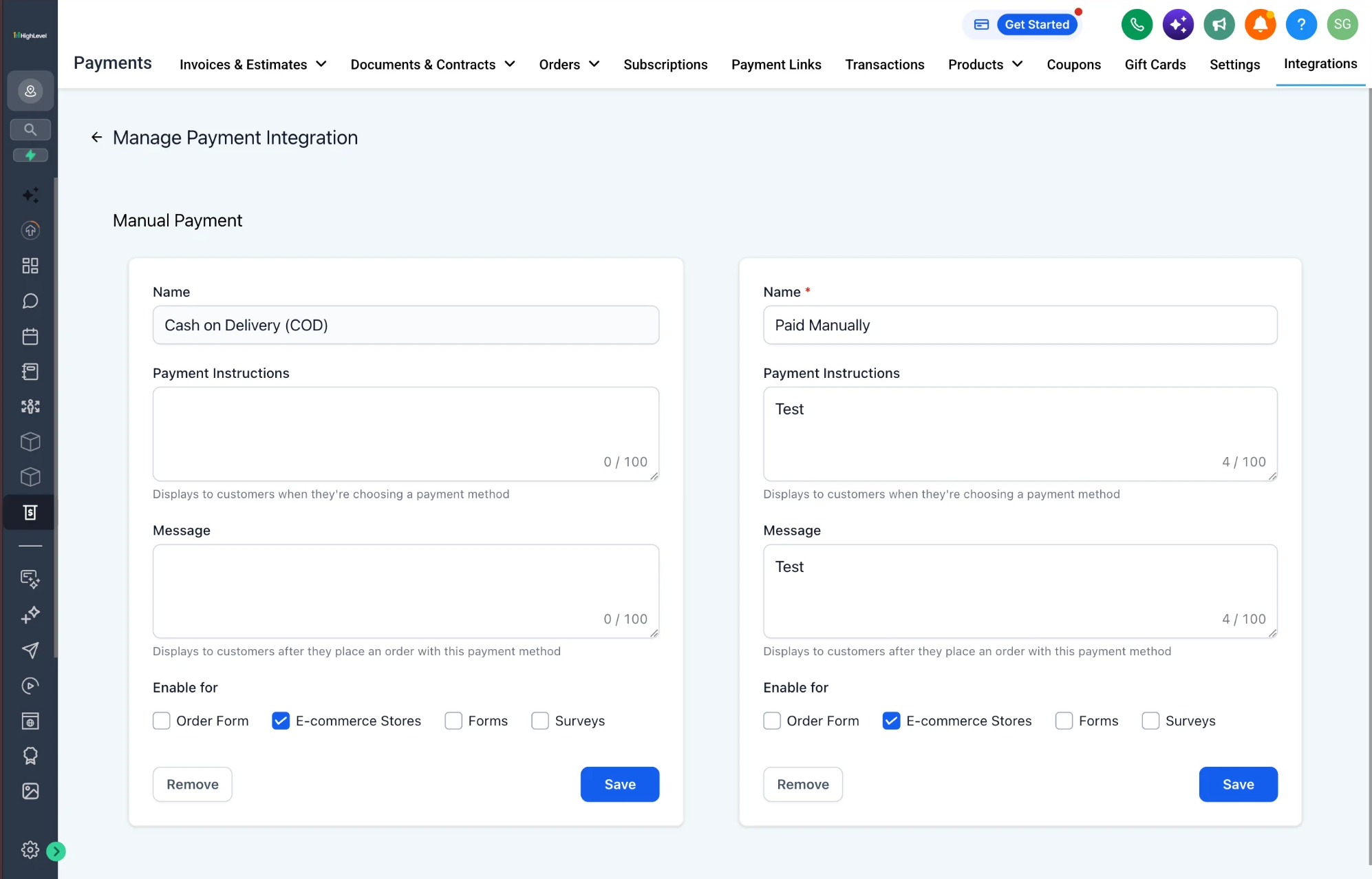
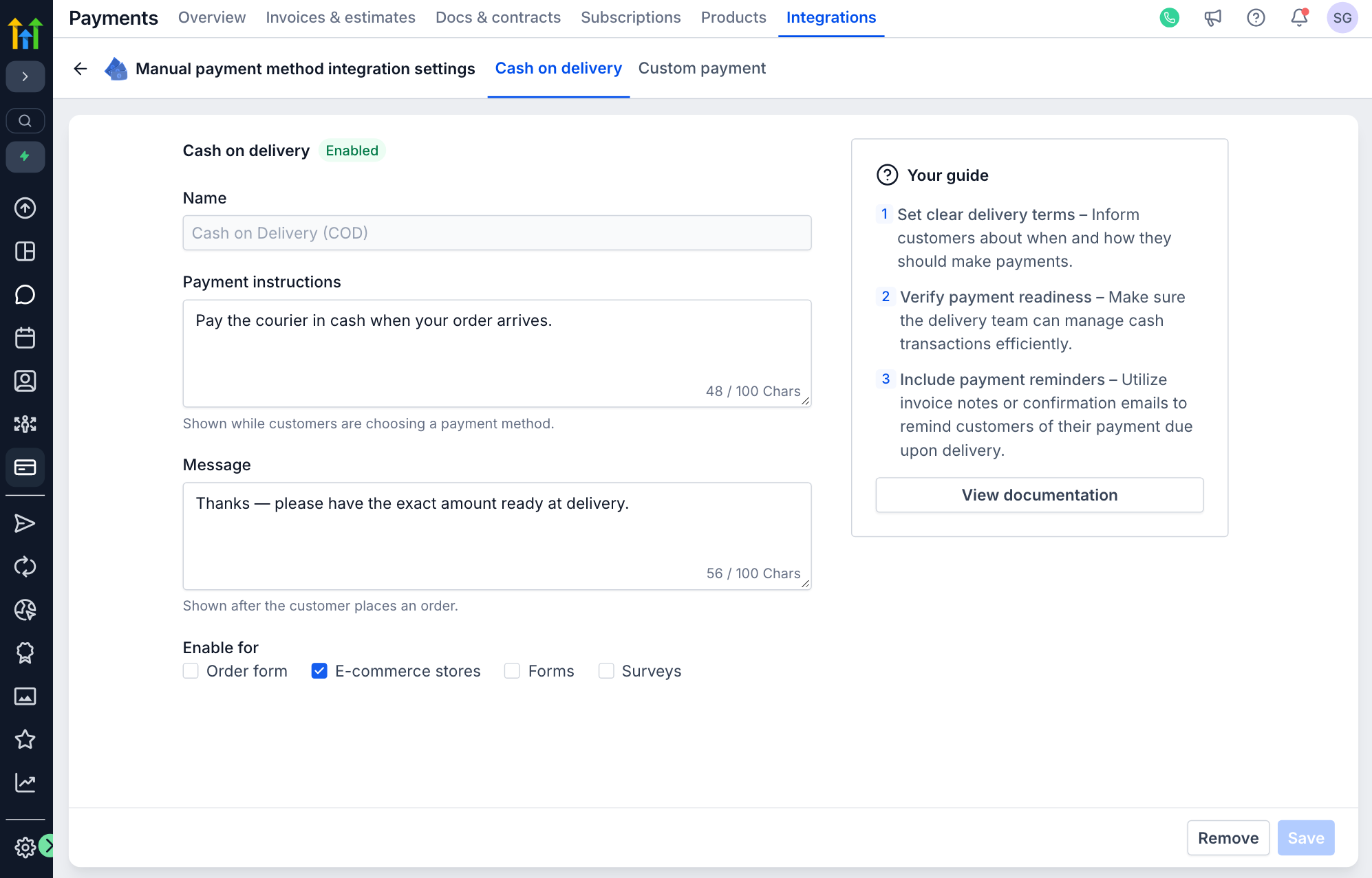
Manual methods have no provider behind them, which made them the easiest to leave unstructured. The fields stayed — name, instructions, message, channels. The structure changed: one method per tab, with a state and a guide.


Drag the handle, or use the left and right arrow keys, to move the divider. Home shows only the redesigned screen; End shows only the original.
Cash on delivery, configured. Before, two independent forms side by side, each with its own save. After, one method per tab, marked enabled, with a guide beside the same fields.
View the complete screens
Compatibility
Change the system without breaking live businesses
None of this was a new product. Businesses were already taking payments through the screens being replaced, so compatibility constrained the redesign rather than following it.
The rollout was sequenced around the core providers, Stripe and PayPal: the integrations landing page launched first, and Stripe followed. At the point this case study represents, only the landing page had rolled out. Settings, methods, manual methods and the channel map were staged and working in the prototype; GoCardless was a staged design.

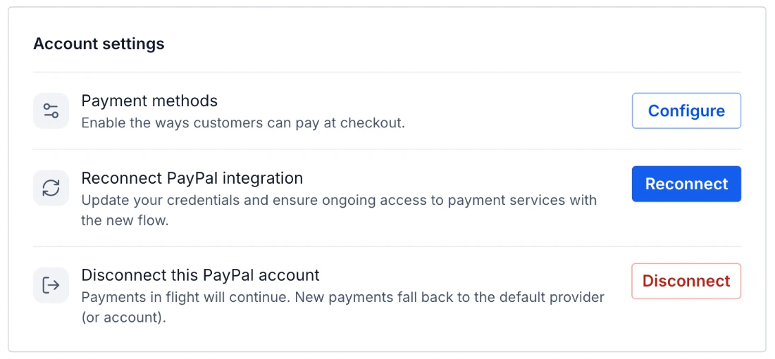
An account connected the old way stays connected, with a route to reconnect through the newer flow, and disconnecting says what happens to payments already in flight.
View the complete screen
What the redesign had to carry over
Preserved states
- Existing state
- Connected Stripe and PayPal accounts, live and sandbox
- Constraint
- A business should not have to set up again
- Where it shows
- Accounts keep their connection, with a route to reconnect
Explicit defaults
- Existing state
- One default provider for every workflow
- Constraint
- Existing routing keeps working until a business changes it
- Where it shows
- A default account; accounts assigned channel by channel
Staged availability
- Existing state
- A provider list grown one integration at a time
- Constraint
- Core providers first: the landing page, then Stripe
- Where it shows
- New providers join the same catalogue
Controlled configuration
- Existing state
- Provider- and region-specific settings shown all at once
- Constraint
- Edge cases disclosed where they apply, not upfront
- Where it shows
- Method tables scoped to a product area and an environment
The requirements the design was held to, and where each shows on the new screens. No incident or migration data is presented.
What the system establishes, and what still needs proof
What the work demonstrates
- One catalogue that states methods, availability and connection before setup.
- One account-state grammar across providers: not connected, enabled, default, live or test.
- Method configuration as one table, scoped to a product area and an environment.
- A channel map that makes the account behind each channel explicit.
- Online, offline and direct-debit providers in one model, with their differences kept.
What remains unproven
- Whether businesses choose a provider, or finish setup, faster.
- Whether configuration errors and support contacts about payments setup fall.
- Whether more businesses connect a provider, and whether the channel map is adopted.
- Whether the model holds as more providers, regions and methods arrive.
- Any effect on payment volume, revenue or other commercial measures.
No usage, support or revenue data is presented on this page. Where the case study says a surface makes something visible, it describes the design—not a measured change in behaviour.

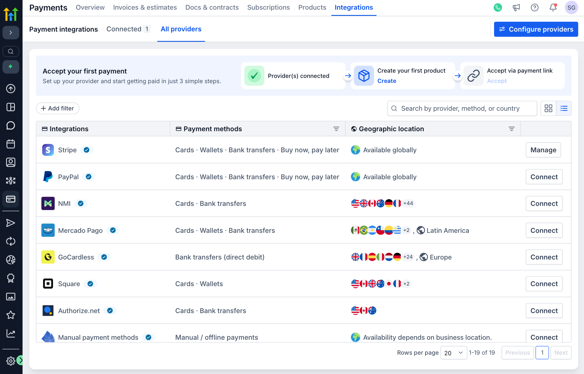
The catalogue’s table view: every provider in the same columns, with the action each one needs.
View the complete screen
The redesign made provider differences explicit without turning each integration into another product to learn.
The working prototype I designed and built for review. Not every surface in it reached production.