Designing the payments ecosystem for discoverability
Redesigned payments into a dynamic hub. The interface adapts to user maturity, shifting from guided setup to real-time revenue insights.
Date
November, 2025
Role
Product Designer, Leading Payments
Company
HighLevel
Service
B2B SaaS dashboard
1. The challenge: an identity crisis
In our previous architecture, the "Payments" tab had an identity crisis. When users clicked it, the system instantly redirected them to an Invoices list.
This created a critical mental model failure:
Hidden value: Users assumed "Invoices" was the only payment capability, completely missing out on Subscriptions, Products, Estimates, and Orders.
Poor onboarding: New users landed on an empty invoice table with zero guidance. They didn't know they needed to connect a gateway or create a product first.
No "home": Established businesses had no centralized view of their revenue health; they had to dig through sub-menus just to see how much money they made that month.
The Goal: Design a centralized payments hub that improves discoverability of features and dynamically adapts to the user's maturity, guiding new users through setup while giving power users instant data.
2. Information architecture
To fix the discoverability issue, I first had to restructure the navigation. I audited the existing flow and realized the redirect was the root cause of the confusion.
The old architecture
The previous model forced a deep link directly to a child page (Invoices), effectively hiding the other 70% of the product's capabilities.
The original structure bypassed the landing page entirely, confusing users about the breadth of the tool.
The new architecture
I moved to a Hub-and-Spoke model. I introduced a parent "Overview" tab that acts as the default landing page. This new node serves as a traffic controller, exposing all operational modules (Invoices, Subscriptions, Products) at a glance while housing the high-level reporting data.
The new structure introduces a "Default Landing Page" that aggregates all payment modules, ensuring features like Subscriptions and Orders are visible immediately.
3. Wireframing: Designing for context
We realized that a single dashboard view wouldn't work for everyone. A brand new user needs education, while an established user needs efficiency.
I designed two distinct "modes" for the same URL, triggered by the user's account history.
Mode A: The "setup guidance" wireframe
Target audience: Users with 0 transactions.
For the empty state, I avoided the standard "There is nothing here" message. Instead, I utilized the space to drive activation using a 3-Step Setup Loop.
Low-fidelity exploration of the Onboarding Mode. I prioritized the "Get Started" loop to focus on the three critical setup tasks: Connecting a Provider, Creating a Product, and Configuring a Channel.
Mode B: The "operational dashboard" wireframe
Target audience: Users with active revenue.
Once a user processes a transaction, the layout transforms. The checklist is replaced by data widgets. The focus shifts from "How do I use this?" to "How is my business doing?"
Low-fidelity exploration of the Dashboard Mode. The top row is dedicated to "Health Metrics" (Revenue, recurring revenue), while the bottom section handles "Recent Activity" to give users a pulse on their cash flow.
4. The final solution
Moving to high-fidelity, I utilized our design system to create a trustworthy, professional financial interface that feels consistent with the rest of the SaaS platform.
The "new user" experience
This view is focused entirely on reducing Time-to-First-Value.
Key design highlights:
Gamified setup: The "Get Started" widget uses a progress bar to encourage completion.
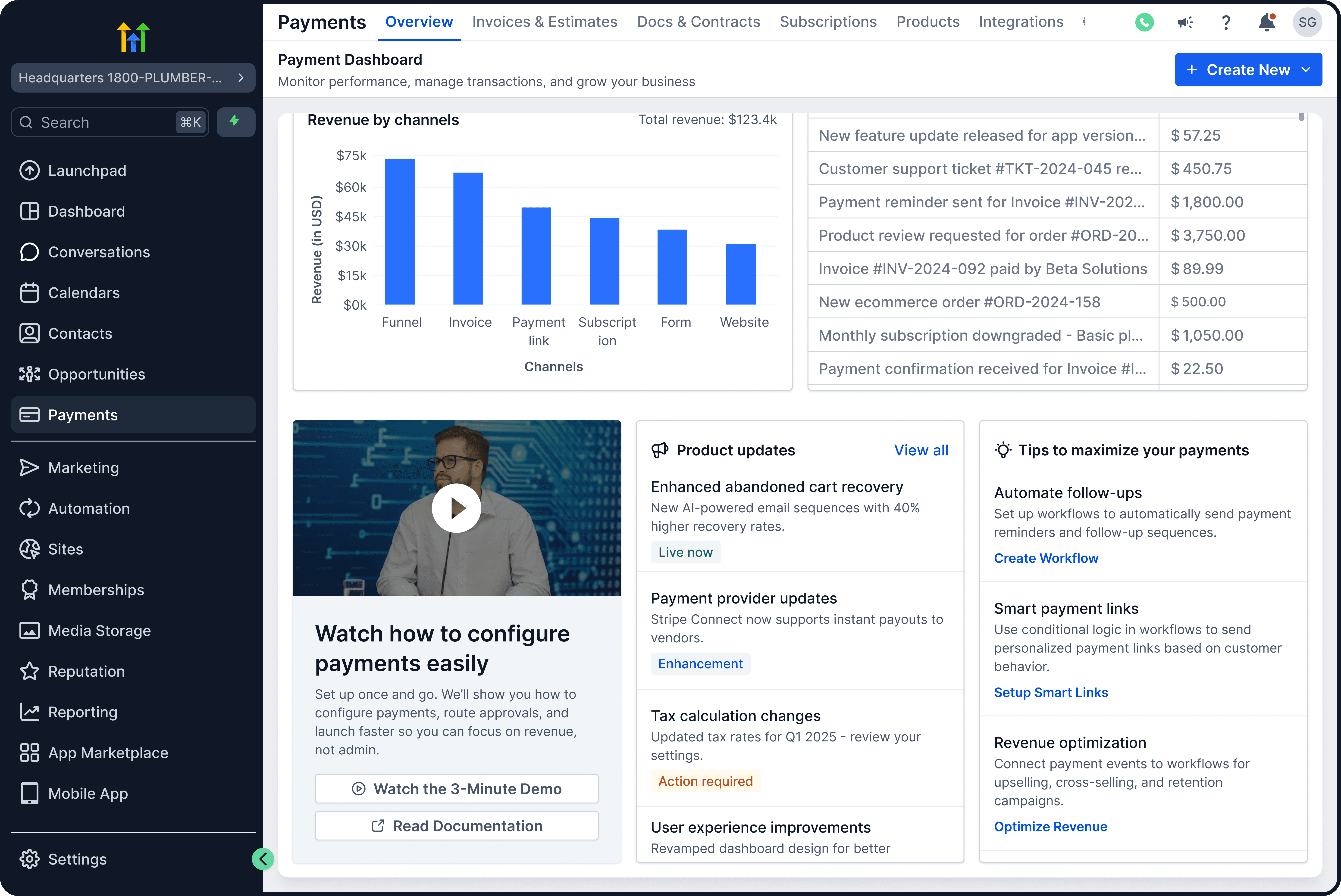
Educational real estate: The "Welcome" banner features a 3-minute demo video, solving the problem of users not knowing "what's possible."
The discoverability grid: The "Unified Payments Suite" at the bottom acts as a visual sitemap, explicitly showing users that they can manage Payment Links, Orders, and Integrations from this single hub.
The "active user" dashboard
This view is focused on Health Monitoring and Quick Actions.
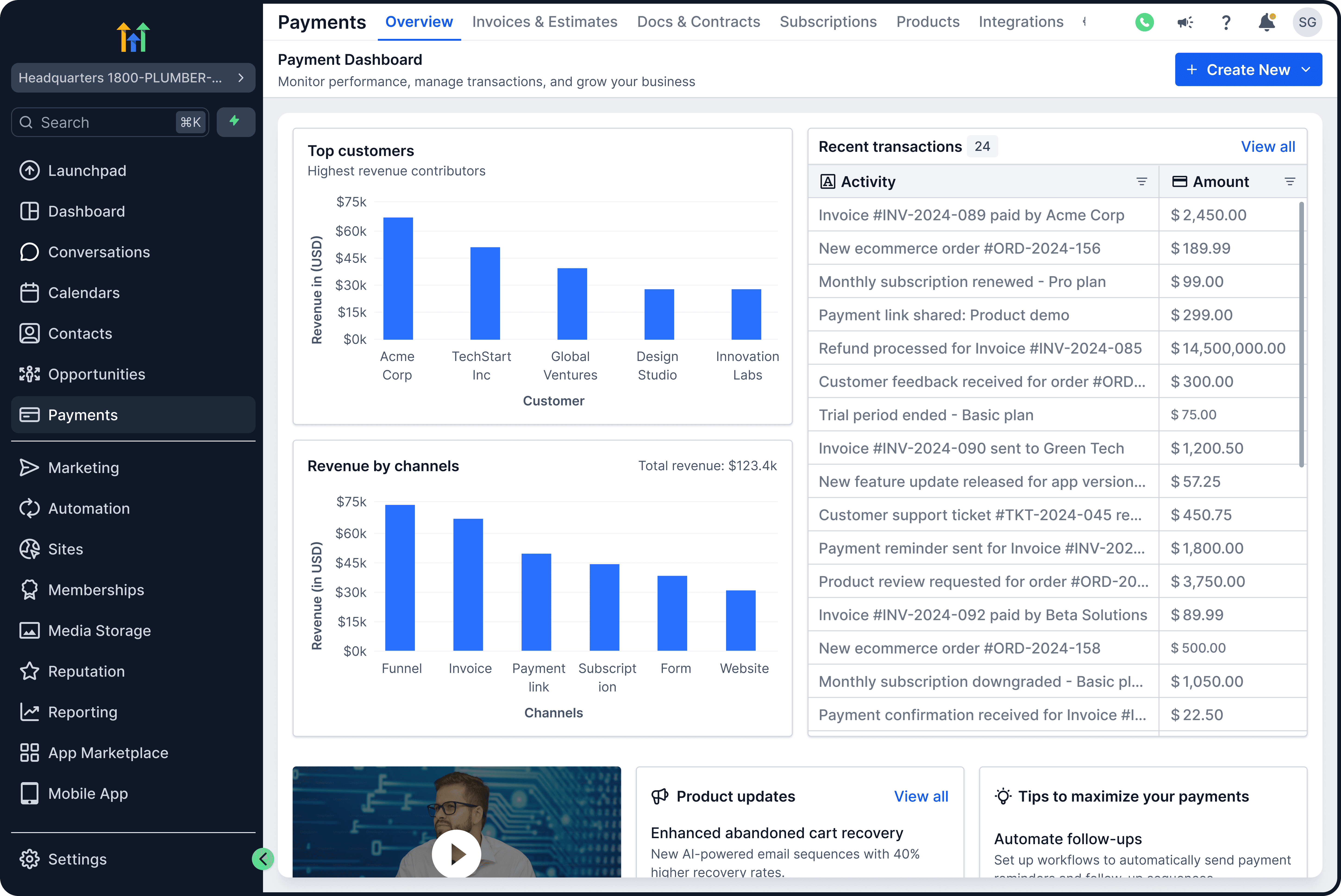
Key design highlights:
Trend indicators: I added Green/Red percentage indicators to the top metrics. Business owners don't just want static numbers; they need to know if they are growing or shrinking compared to last month.
Global "Create New" button: In the top right, I added a primary action button. This allows a power user to generate an Invoice or Subscription immediately without navigating away from their dashboard.
Visualizing growth: The "Revenue Trends" and "Product Revenue Distribution" charts replace static tables, helping users identify their best-selling items instantly.
5. The impact
By restructuring the Information Architecture and introducing dynamic states, we transformed "Payments" from a confused utility list into a strategic business hub.
100% visibility: Features like Subscriptions and Products are now visible on the first click, solving the "hidden feature" problem.
Contextual relevance: Users no longer face "Empty State" fatigue; they see the right interface (Setup vs. Data) at the right time in their journey.
Business insight: The new dashboard gives small business owners enterprise-level reporting on their financial health without needing to export data to Excel.