Intripid trip planner (AI-powered itinerary builder)
A full UX/UI redesign of Intripid’s AI-driven trip builder - transforming a complex travel-planning workflow into a simple, guided experience. Includes workflow restructuring, multi-platform interface design, and system-driven components that improve clarity and reduce friction for both travelers and advisors.

Date
December, 2024
Role
Product Designer
Organization
Intripid
Services
User-Centered Design, Intuitive User Interface (UI), Visual Design, Responsiveness and Accessibility
👋 Project overview
Intripid’s Trip Planner is an AI-powered tool that helps travelers and advisors build personalized itineraries through an interactive calendar and day-by-day workflow. My role involved redesigning the entire experience to make trip creation intuitive, structured, and visually organized.
🧐 Understanding the problem
Planning a multi-day trip involves juggling multiple moving parts - stays, activities, commutes, timings, and personal preferences. The earlier version of Trip Planner:
Scattered key actions across multiple screens
Forced users to constantly jump between editing and viewing
Lacked clarity between “day structure,” “trip details,” and “activity planning”
Had weak hierarchy, making information hard to scan
This created friction for both travelers and advisors.
🚩 Key challenges
Complex, nested workflows (stays → activities → timings → trip-wise overview)
Designing for both mobile and desktop simultaneously
Ensuring the calendar feels familiar, predictable, and easy to manipulate
Handling edge cases: overlapping events, missing timings, travel days, etc.
Ensuring users can add/edit/reorder activities quickly
🕵 Research
Competitive analysis

I reviewed products like TripAdvisor, Tripit, Wanderlog, Tripoto, Wonderplan, etc., that offer a group booking/planning experience to understand user expectations better and what solutions can be offered.
Some specific problems with these tools were:
Trip planning, booking, and collaboration are spread across multiple tools instead of being integrated into one seamless platform.
Recommendations are either generic or non-existent, lacking personalization.
Users can’t easily rearrange activities in a visual timeline or calendar view.
Most platforms don’t allow multiple users to edit and adjust an itinerary dynamically.
Without a calendar-based interface, users struggle to see how activities fit into their daily schedule. This results in overlapping plans, inefficient travel routes, and missed experiences.
I structured the redesign around three principles:
1. Make the timeline the heart of the product
The calendar became the anchor point so users always know where they are in their trip.
2. Reduce cognitive load through modular design
Activities, stays, and commutes became structured blocks with consistent patterns.
3. Keep creation and editing workflows tightly connected
Users should be able to make changes without losing context.
💡 Designing a solution
Now, based on the insights from the user research and understanding approach of the similar apps, I tried to jot down the features that I felt would be possible solutions.
User persona
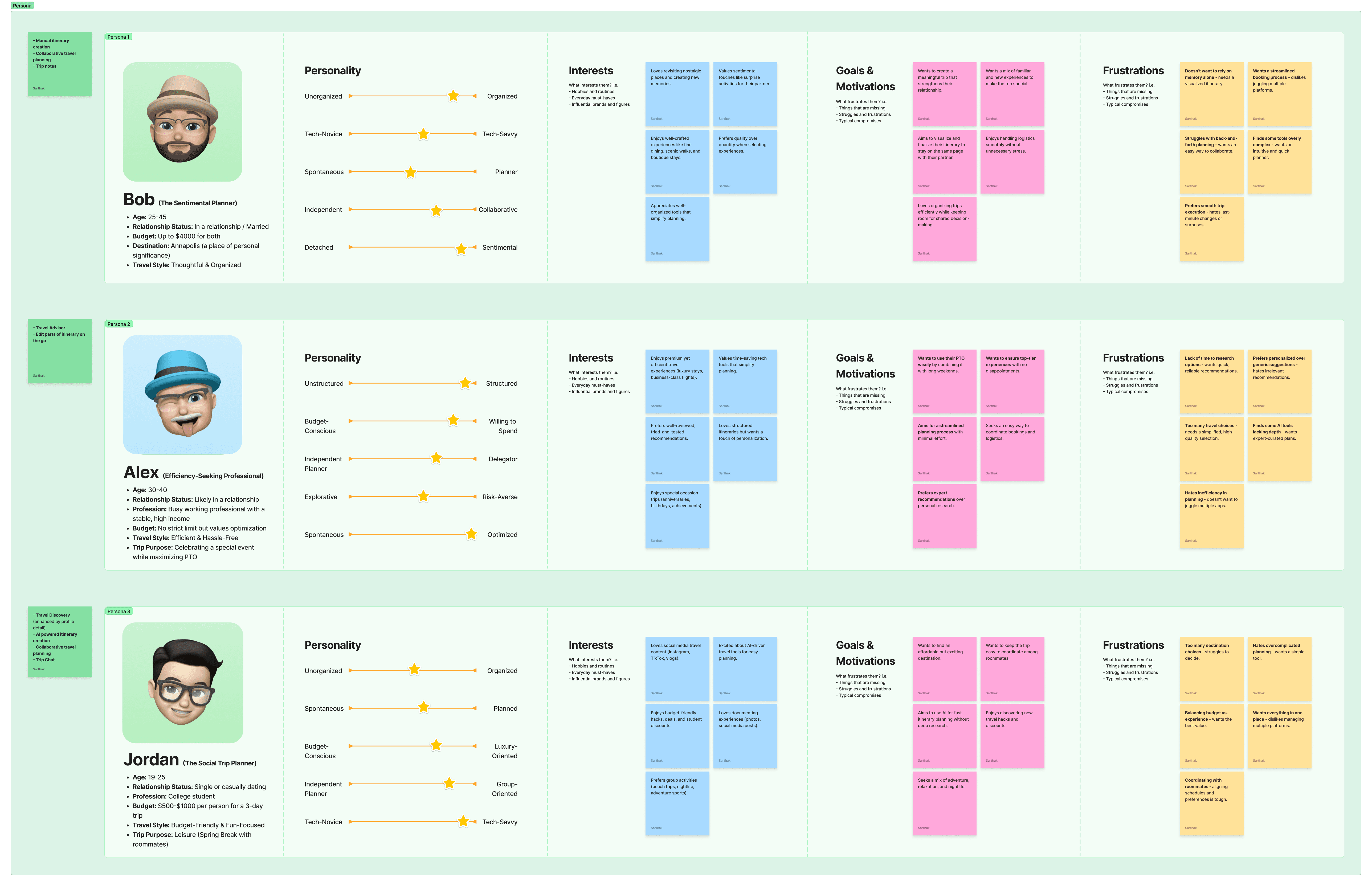
User journey

Moodboard
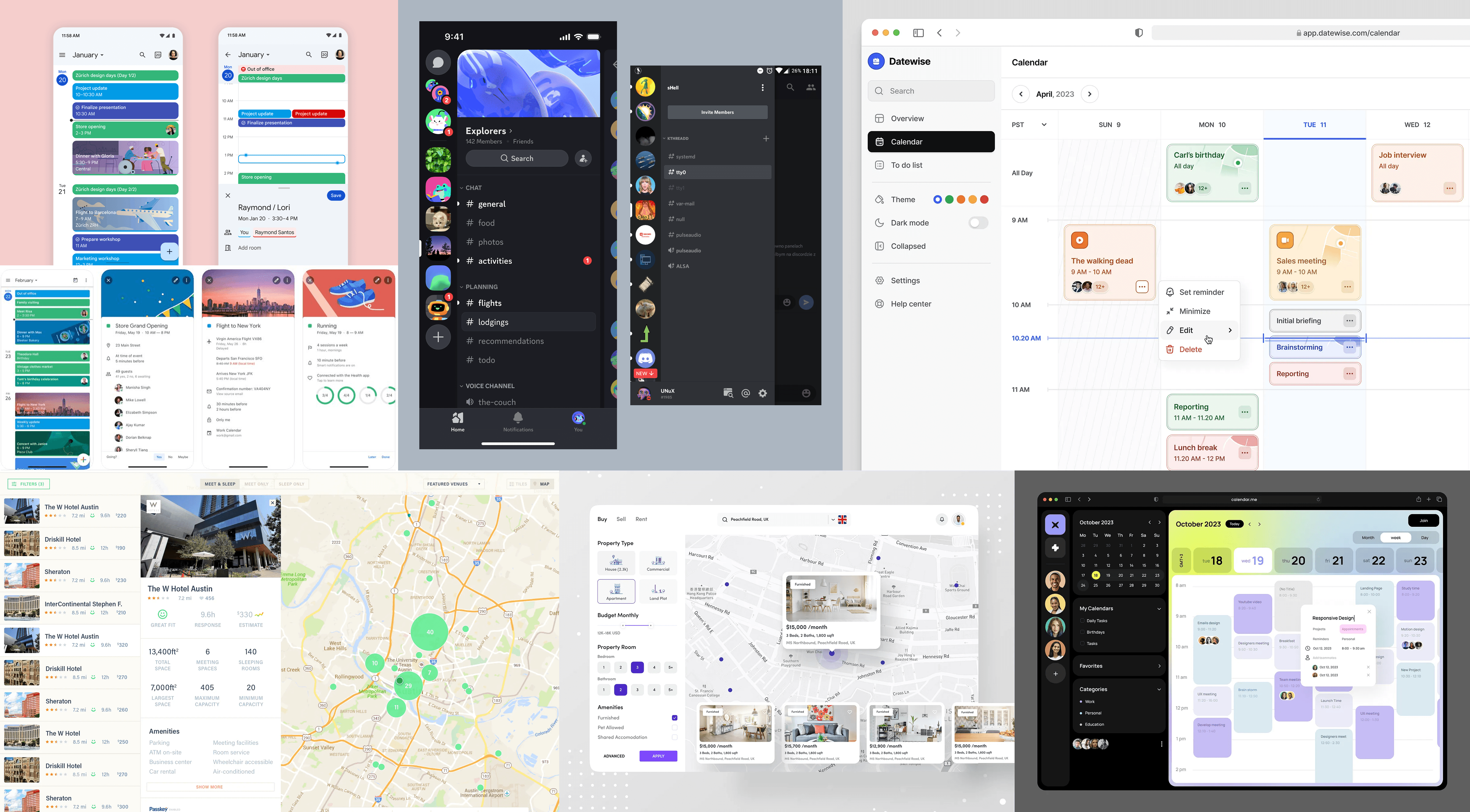
Going online and finding inspirational work from other great designers/organizations is also really key. I drew inspiration from Google Calendar’s structured scheduling, Discord’s seamless navigation, and Samsung’s software UI to create an experience that was both intuitive and efficient.
Dribbble is my go to website that I visit every day just to keep up to date with the new trends and look for inspiration when starting out with new projects. I also save every dribbble shot that I like and categorize them so that when I start out a new project like this one, I can easily filter out the ones that could help me come up with a great design.After gathering a few designs similar to the design I aim for, I create a moodboard which I use along the way to inspire myself in case I get stuck.
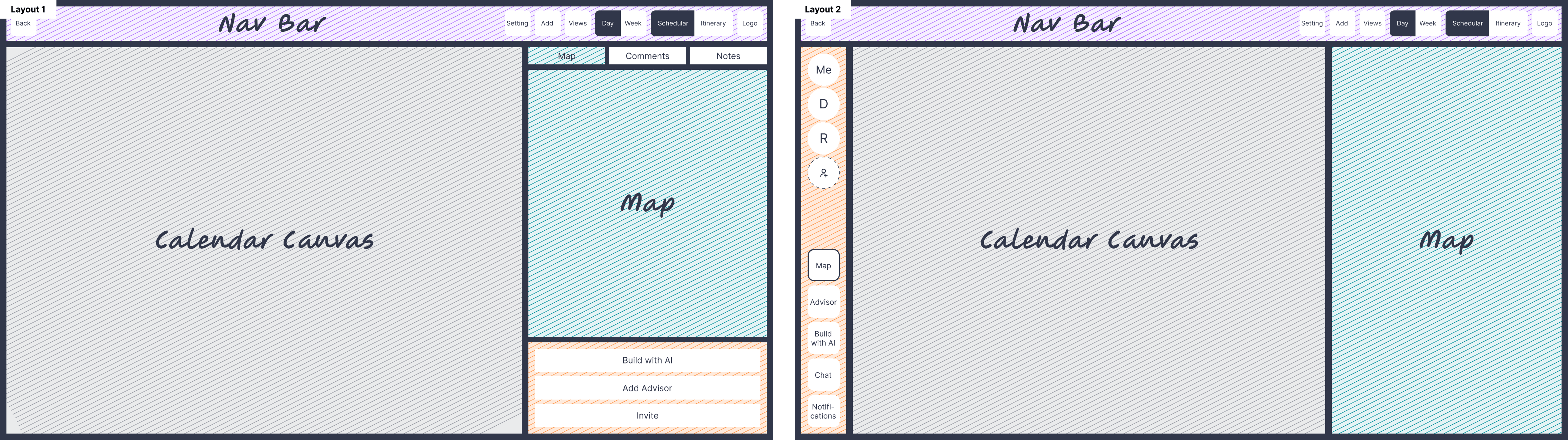
Wire-framing
Layout

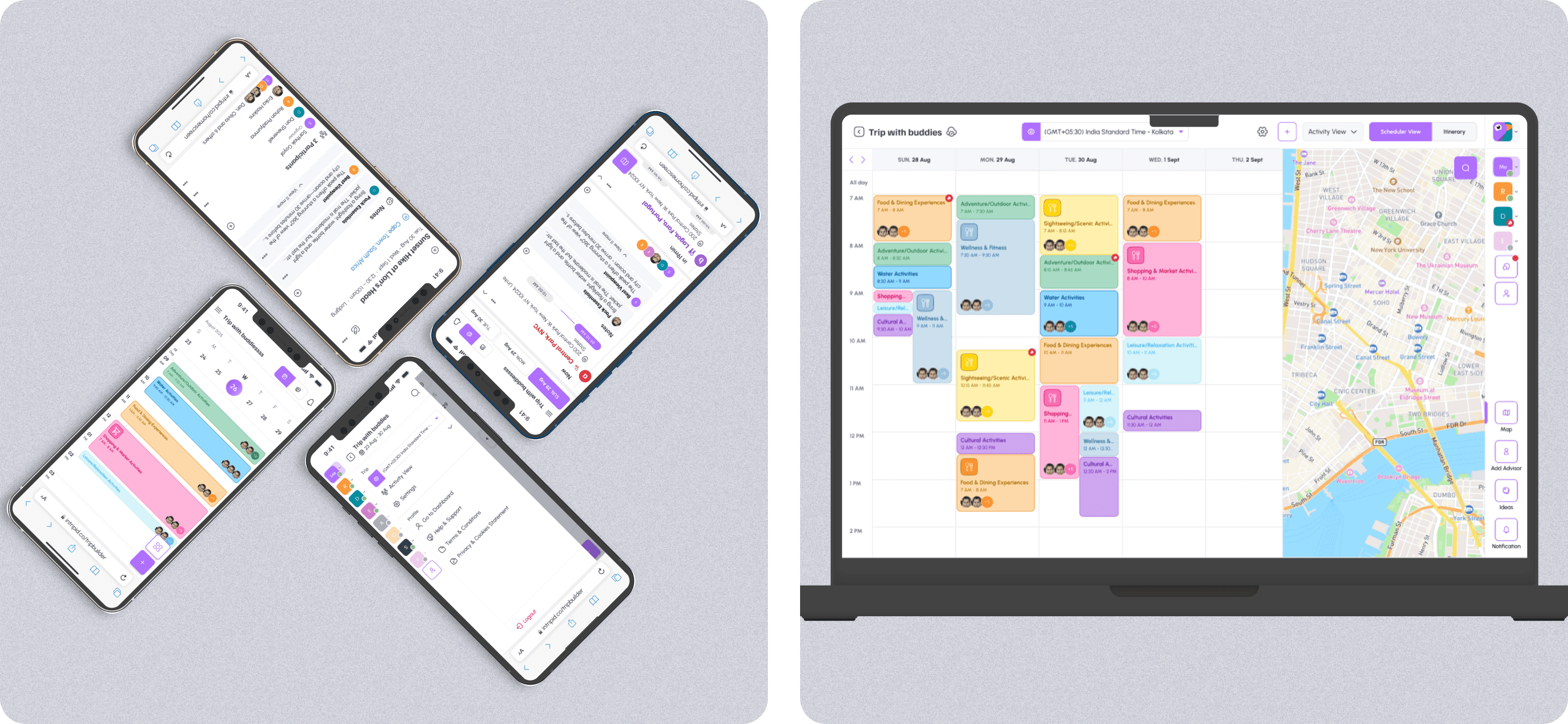
Visual designs (🖥️ Desktop version)
Once the functionality was refined, the final step was crafting a visually engaging UI that aligned with Intripid’s brand identity.
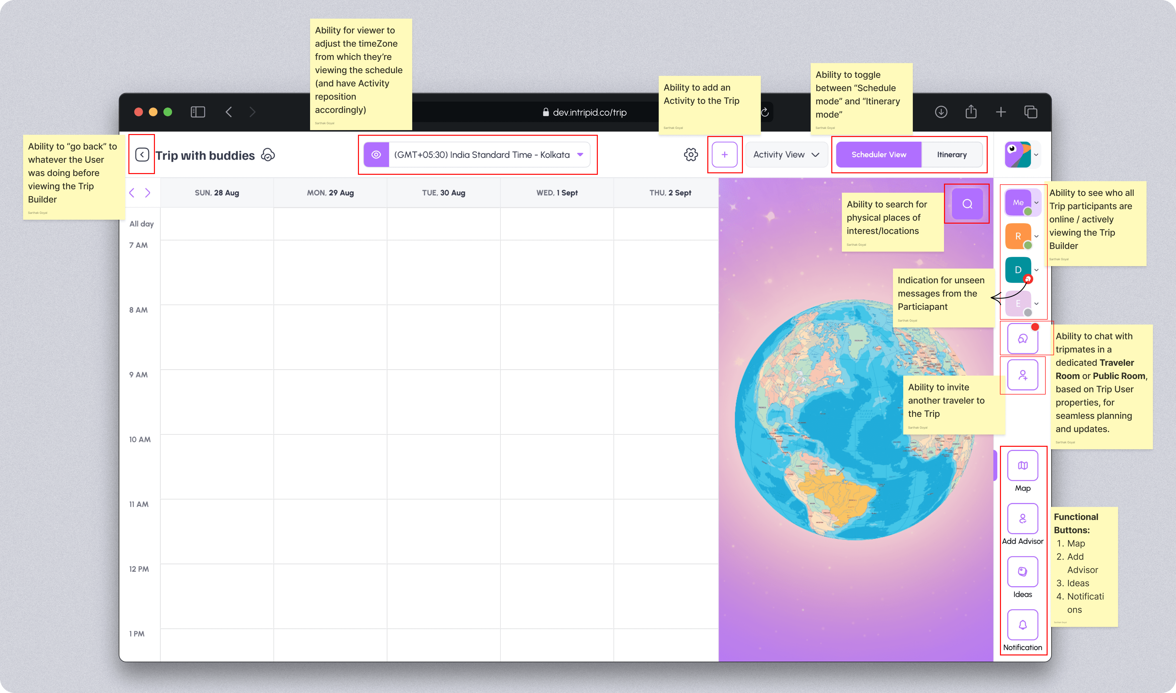
Scheduler View
Understanding the components
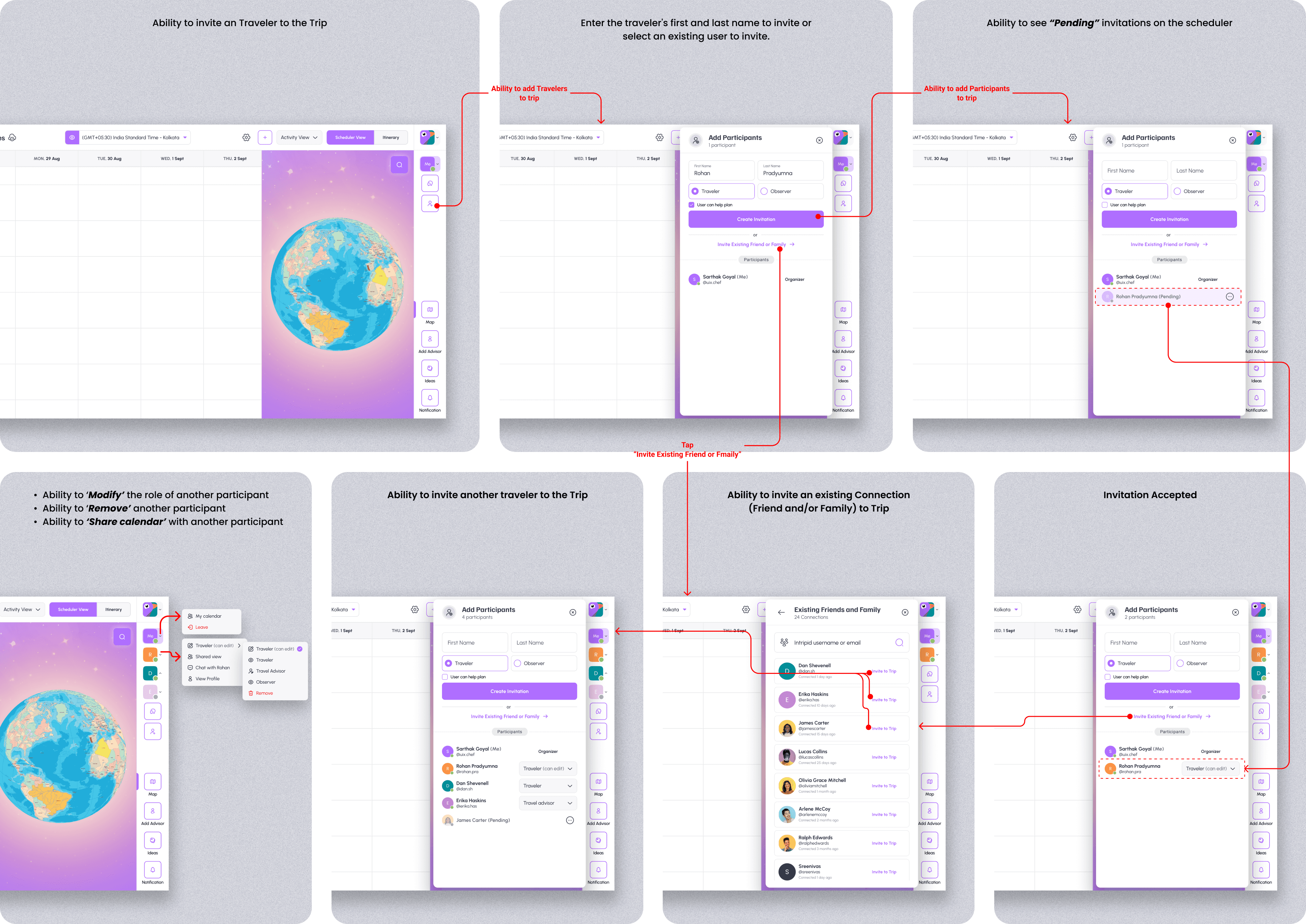
Inviting travelers to the trip
Collaboration is a key part of Intripid, and these screens highlights the ability to invite new travelers or add existing connections to the trip. Users can share their itinerary with others, allowing for real-time input, modifications, and shared trip planning, making group travel more coordinated and hassle-free.
Adding an activity in scheduler view
These screens demonstrates the ability to set detailed parameters for an activity within the Trip Builder’s scheduler view. Users can precisely configure each activity by defining: Location, Category, Title, DateTime begin, DateTime end. With these features, users can effortlessly manage activities, ensuring a well-structured and collaborative itinerary-building experience.


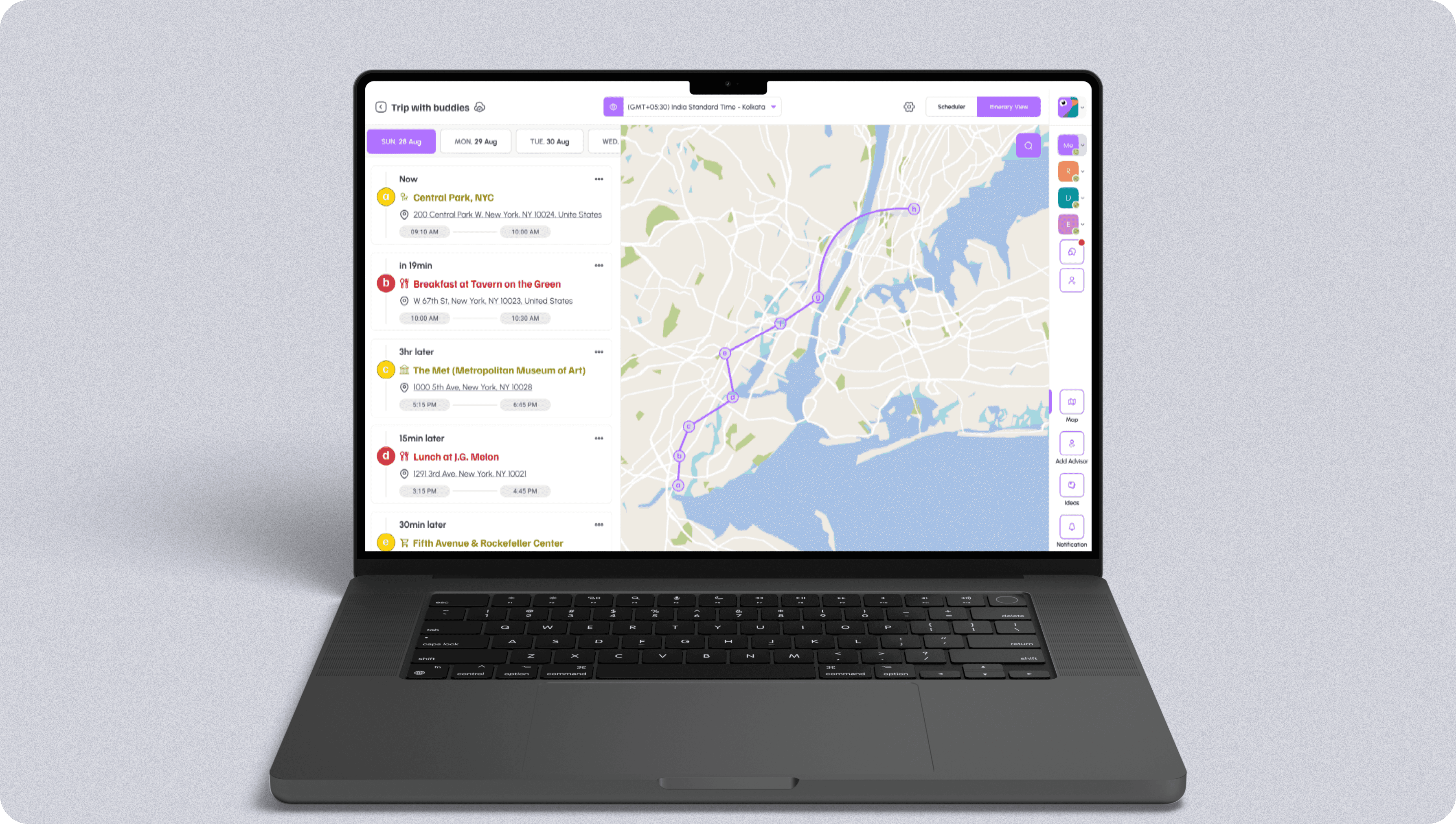
Itinerary view
Visual designs (📱Mobile version)
Adapting the Trip Builder’s complex functionality into a mobile-friendly experience came with several challenges. The goal was to ensure users could seamlessly plan, modify, and collaborate on trips despite the constraints of a smaller screen.
Unlike the desktop version, which had ample space to display the scheduler, activity panel, and AI suggestions simultaneously, the mobile interface required a more focused and intuitive approach. Key actions had to be prioritized, ensuring users could efficiently interact with their itinerary without feeling overwhelmed.
To tackle these challenges, I drew inspiration from Google Calendar’s structured scheduling, Discord’s seamless navigation, and Samsung’s software UI to create an experience that was both intuitive and efficient.
Scheduler view

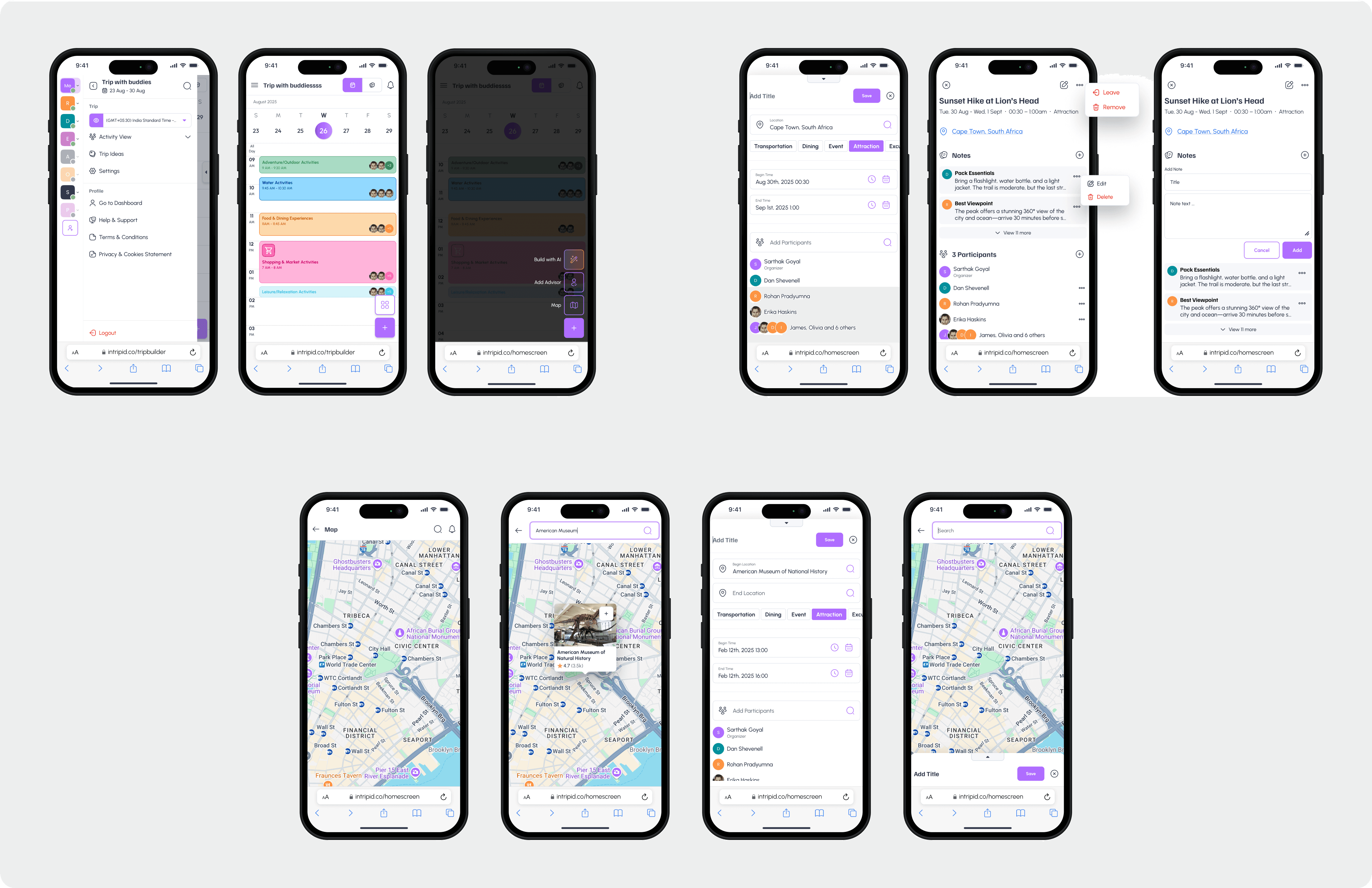


Itinerary view

